
On 5 Sept 2018, the NCAA Research team tweeted out this chart :
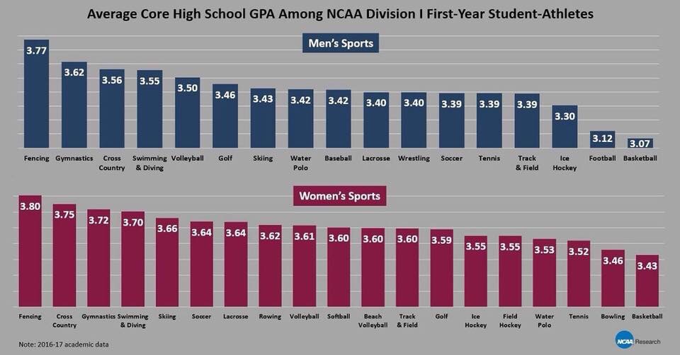
It reports the average core high school grade point averages (GPA) among NCAA Division I freshman student athletes. So, a bit of a background – the National Collegiate Athletics Association governs just about all collegiate athletic programs in America, and the Division I schools devote the most money and resources to their athletic programs. A great deal of attention is thus focused on the Division I programs, almost to the detriment of the others (it goes all the way to Division III). The GPA is usually used as a measure of academic performance, though it may not reflect the difficulty of the coursework. But this chart is an egregious use of “infographics” to mislead rather than to bring insight to data:
- Without a Y-axis to denote scale, the use of bar charts here visually make it appear that 3.77 is 7x higher than 3.07, when it’s actually far smaller in scale on standard 4.0 GPA scales (it tops out at 4).
- The categorical use of the different sports makes it appear that it is the independent variable, and that GPA is what is being measured. But since the GPA was measured in high school, it actually precedes the sport.
- Because of this switch in dependent and independent variables, a reader may interpret some form of causality – implying for example that choosing fencing will lead to better academic performance.
Good data visualization should serve to bring new insight to the data that isn’t evident from just looking at the numbers. The GPAs considered here range between 3-4, which is letter grade B-A, quite above average academically, and that is unsurprising. These are the high school GPAs of student athletes recruited to Division I schools, arguably the most competitive programs. This is a measure of their past academic performance, but doesn’t say anything about how the sport chosen affects their current or future performance. The data, however, informs something about the sports programs themselves. Using the exact same data, I replotted the chart.
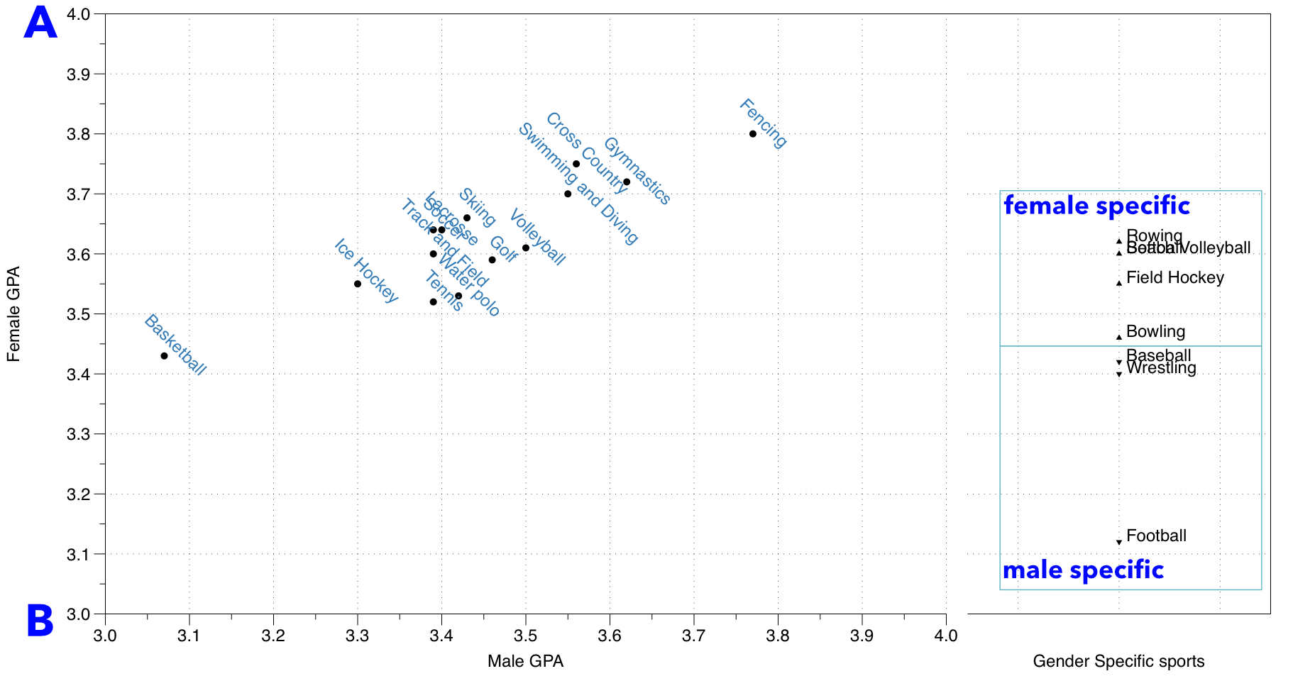
The chart is in two parts – on the left is the section where a sport is available for both males and females, and on the right is a smaller section for sports that are gender specific. The axes go from 3.0 to 4.0, indicating the spread within this range. Sports are labeled accordingly.
A linear relationship exists between enrolled female and male student athlete high school GPAs – regardless of sport program. What this means is that at least within each sport, they apply their GPA criteria roughly with the same proportion to both genders. Which probably means that the sports programs recruit from the same communities for both men and women, that is fencing programs put a heavier emphasis on high GPAs for admission than basketball programs do, regardless of gender. But we see a stark difference in the GPA cutoffs between genders: almost all athletic programs recruit females with a GPA above 3.5, while more than half athletic programs enrolled male student athletes with GPAs below 3.5. In fact, all the male specific sport programs – baseball, wrestling and football – recruit with GPAs below 3.5. One cannot make definitive interpretations without further details on how the data is collected, but this implies that the barrier to entry to a collegiate athletic program, at least based on GPA, is significantly lower for males than for females. While some may think that this indicates superior academic performance among female student athletes, it could be an indicator for a systemic bias when recruiting for women across all sports programs.
Leave a Reply