dr.ricky online

Category: Data Visualization

  • COVID-19 Tests

    COVID-19 Tests

    Coronavirus in Texas
    Snapshot from Texas Tribune tracking of coronavirus testing in Texas.

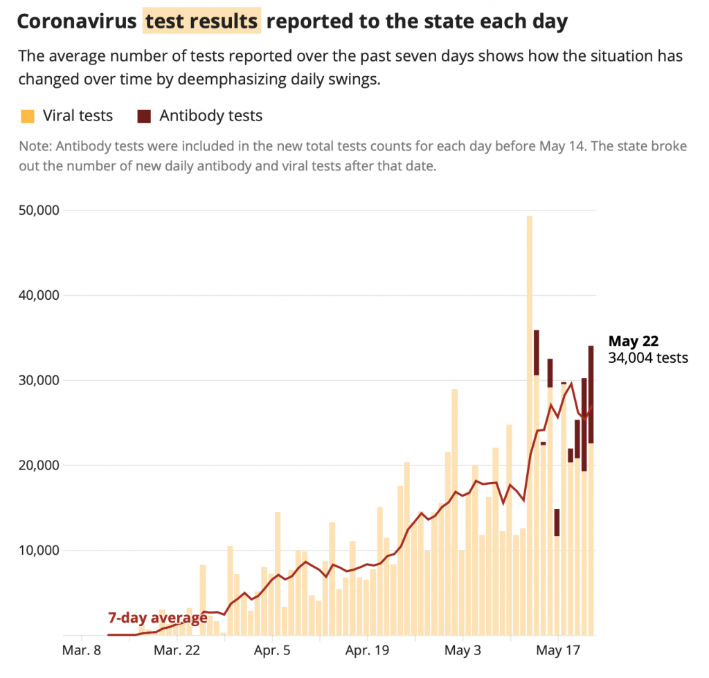
    Before May 14, 2020, Texas reporting of coronavirus test mixed results from two different kinds of tests: the PCR tests and the antibody tests. The PCR test looks for the presence of the genetic material of SARS-COV-2, it answers the question: “Is the patient infected and contagious?”

    The other kind, the antibody test, looks for the presence of early antibodies in the blood. It answers the question, “Has the patient been infected in the past?” At this time, we do not know if the presence of antibodies confers immunity to the virus

    Mixing the two results is highly problematic. It can make it appear that there are fewer infectious individuals, since antibody tests tend to come up negative more, and that inflates the denominator. Part of the reason why Gov Abbott proceeded with Phase 2 in reopening Texas activities is be attributed the increasing rate of detected infections to an increased number tests happening. However, that is not the case – much of this increase is due to mixing of the antibody tests. The rate of PCR tests is almost flat, but the rate of new infected cases continue to rise. 

  • Visualizing NCAA GPA data

    On 5 Sept 2018, the NCAA Research team tweeted out this chart  :

    It reports the average core high school grade point averages (GPA) among NCAA Division I freshman student athletes. So, a bit of a background – the National Collegiate Athletics Association governs just about all collegiate athletic programs in America, and the Division I schools devote the most money and resources to their athletic programs. A great deal of attention is thus focused on the Division I programs, almost to the detriment of the others (it goes all the way to Division III). The GPA is usually used as a measure of academic performance, though it may not reflect the difficulty of the coursework. But this chart is an egregious use of “infographics” to mislead rather than to bring insight to data:

    • Without a Y-axis to denote scale, the use of bar charts here visually make it appear that 3.77 is 7x higher than 3.07, when it’s actually far smaller in scale on standard 4.0 GPA scales (it tops out at 4).
    • The categorical use of the different sports makes it appear that it is the independent variable, and that GPA is what is being measured. But since the GPA was measured in high school, it actually precedes the sport.
    • Because of this switch in dependent and independent variables, a reader may interpret some form of causality – implying for example that choosing fencing will lead to better academic performance.

    Good data visualization should serve to bring new insight to the data that isn’t evident from just looking at the numbers. The GPAs considered here range between 3-4, which is letter grade B-A, quite above average academically, and that is unsurprising. These are the high school GPAs of student athletes recruited to Division I schools, arguably the most competitive programs. This is a measure of their past academic performance, but doesn’t say anything about how the sport chosen affects their current or future performance. The data, however, informs something about the sports programs themselves. Using the exact same data, I replotted the chart.

    High school GPA of males and females as recruited into NCAA Div 1 sports programs.

    The chart is in two parts – on the left is the section where a sport is available for both males and females, and on the right is a smaller section for sports that are gender specific. The axes go from 3.0 to 4.0, indicating the spread within this range. Sports are labeled accordingly.

    A linear relationship exists between enrolled female and male student athlete high school GPAs  – regardless of sport program. What this means is that at least within each sport, they apply their GPA criteria roughly with the same proportion to both genders. Which probably means that the sports programs recruit from the same communities for both men and women, that is fencing programs put a heavier emphasis on high GPAs for admission than basketball programs do, regardless of gender. But we see a stark difference in the GPA cutoffs between genders: almost all athletic programs recruit females with a GPA above 3.5, while more than half athletic programs enrolled male student athletes with GPAs below 3.5. In fact, all the male specific sport programs – baseball, wrestling and football – recruit with GPAs below 3.5. One cannot make definitive interpretations without further details on how the data is collected, but this implies that the barrier to entry to a collegiate athletic program, at least based on GPA, is significantly lower for males than for females. While some may think that this indicates superior academic performance among female student athletes, it could be an indicator for a systemic bias when recruiting for women across all sports programs.

  • The Texas Primary Elections: by the numbers

    It’s the day after the Texas Primary Elections, which serves to narrow the field for the two major American political parties heading into the midterm elections in the fall. Here in Houston, which sits in Harris County, the results are posted online for the Republican Primaries and the Democratic Primaries as PDF files. A peculiar anomaly in the posting of the election results is how the totals are reported. At the top of each report is:

    Republican: District Voters: 155,798 of 2,249,591 = 6.93%
    Democratic: Number of District Voters: 167,396 of 2,249,591 = 3.72%

    The total number of registered voters match up between the two reports, but while the Democratic numbers are slightly higher than the Republican numbers, the reported percentage is nearly half. Puzzling.

    Most of the news have focused on the individual candidates vying for public office, but the party ballots also included a number of Propositions – statements which appear to reflect the party’s overall priorities and stances on certain issues. The primary election could also serve as a type of referendum on how party affiliated voters feel about them. The wording is distinctly different between the two parties. At least the Democratic Party used short subheadings to summarize each proposition. Voters in the Republican primary are more divided in the Propositions presented, with the topics involving abortion and replacing property taxes with consumption taxes both receiving over 30% against. Given that the wording is designed to appeal to tribal identity, this is pretty significant. There’s a glimmer of hope that even voters don’t want the abortion or “bathroom bill” to remain central to the Republican identity. Meanwhile, the loftier “Rights” wording of the Democrats seem to resonate fairly well with the electorate.

    Stacked bar graph showing the heterogeneity of the results for the Republican propositions vs the relative homogeneity for the Democratic primary

    Republican Propositions

    Proposition Description For Against Total %for %against
    1 Replace property tax with consumption tax 92,468 48,498 140,966 65.60% 34.40%
    2 No governmental entity should ever construct or fund construction of toll roads without voter approval. 130,409 16,904 147,313 88.53% 11.47%
    3 Republicans in the Texas House should select their Speaker nominee by secret ballot in a binding caucus without Democrat influence. 123,396 21,872 145,268 84.94% 15.06%
    4 Texas should require employers to screen new hires through the free E-Verify system to protect jobs for legal workers. 132,206 14,896 147,102 89.87% 10.13%
    5 Texas families should be empowered to choose from public, private, charter, or homeschool options for their children’s education, using tax credits or exemptions without government constraints or intrusion. 120,457 27,276 147,733 81.54% 18.46%
    6 Texas should protect the privacy and safety of women and children in spaces such as bathrooms, locker rooms, and showers in all Texas schools and government buildings. 130,355 18,026 148,381 87.85% 12.15%
    7 I believe abortion should be abolished in Texas. 91,786 53,209 144,995 63.30% 36.70%
    8 Vote fraud should be a felony in Texas to help ensure fair elections. 139,556 9,248 148,804 93.79% 6.21%
    9 Texas demands that Congress completely repeal Obamacare. 125,942 21,490 147,432 85.42% 14.58%
    10 To slow the growth of property taxes, yearly revenue increases should be capped at 4%, with increases in excess of 4% requiring voter approval. 137,348 9,355 146,703 93.62% 6.38%
    11 Tax dollars should not be used to fund the building of stadiums for professional or semi-professional sports teams. 129,860 18,179 148,039 87.72% 12.28%

    Democratic Propositions

    Proposition Description For Against Total %for %against
    1 Right to a 21st Century Public Education 153,406 5,586 158,992 96.49% 3.51%
    2 Student loan debt relief 147,747 10,830 158,577 93.17% 6.83%
    3 Right to universal healthcare 153,461 6,138 159,599 96.15% 3.85%
    4 Right to economic security 152,653 5,682 158,335 96.41% 3.59%
    5 National jobs program 147,703 8,719 156,422 94.43% 5.57%
    6 Right to Clean Air, Safe Water, and a Healthy Environment 157,466 1,821 159,287 98.86% 1.14%
    7 Right to dignity and respect (antidiscrimination) 153,465 5,179 158,644 96.74% 3.26%
    8 Right to housing 147,590 9,614 157,204 93.88% 6.12%
    9 Right to vote 152,838 5,884 158,722 96.29% 3.71%
    10 Right to a fair criminal justice system 154,559 3,864 158,423 97.56% 2.44%
    11 Immigrant rights 151,231 7,310 158,541 95.39% 4.61%
    12 Right to Fair Taxation 153,060 4,753 157,813 96.99% 3.01%
  • Vaccination Exemptions in the USA

    Vaccination Exemptions in the USA

    Vaccination Exemptions in the USA

    The United States Centers for Disease Control (CDC) publishes a Morbidity and Mortality Weekly Report, and in it they track the vaccination rates in different states for children enrolled in kindergarten, and an interesting table is the report on the rate of exemptions from vaccinations, as well as the reason behind it. Granted, different states have varying laws with regards to vaccination requirements, and some allow separation of the exception reasons between medical, religious and other philosophical reasons, which makes getting consistent data problematic. But we do have good data for the 2015–2016 enrollment, and the 2016–2017 enrollment.

    The reports themselves are straight tables, but data visualization helps in teasing out the meaning there.

    2016_2017_CDC
    Summarizing the CDC reports between 2015-2016 and 2016-2017 school years for the rate of vaccine exemptions among kindergarten students, divided by state. A number of states are excluded. Blue dots are for the earlier year, red dots for the data a year later. Note that for herd immunity, the general consensus is about 95% of the population should be vaccinated. The Y-axis displays the ratio between medical and non medical reasons given for the exemption. Note that with the exception of DC, all states have ratios below 1, which means that more people are seeking exemptions for religious or philosophical reasons than for medical ones. 

    This data is dense, but highlights some problematic states, like Oregon, which has an unusually high rate of vaccine exemptions, and most of them for non medical reasons. Let’s look at the trend from year to year.

    Change year
    The arrows point in the direction which portend better public health trends: a drop in the rate of exemptions, and an increase in ratio of medical to non-medical reasons. California and Vermont seem to be on the right track, but most of the country is actually inching in the wrong direction, with Nevada and Wisconsin leading the way. 

    Sadly, the antivaccinationist movement seems to be permeating the mindshare, just by manipulating doubt and exploiting parental concern. Non medical exemptions are a key to this degradation of our public health system.